
Adding an automatic table of contents to a blog website improves user experience in a direct, measurable way by helping readers understand the structure, jump to relevant sections, and navigate long-form content without friction.
For blogs that publish detailed guides, research-driven articles, or tutorials exceeding 1,500 words, an automatic table of contents reduces scroll fatigue, increases time on page, and improves content accessibility without altering the editorial voice or layout logic.
Why Long-Form Blogs Need a Table of Contents Today
Long-form blogging has become the dominant format for authoritative content over the past decade. Multiple industry analyses show that articles above 1,800 words consistently outperform shorter posts in organic search visibility, backlink acquisition, and dwell time.
Backlinko’s large-scale study of Google search results found that the average first-page result exceeds 1,400 words, and similar datasets from Ahrefs and Semrush show that informational queries favor structured, in-depth pages.
This shift created a usability problem. As articles grew longer, scrolling replaced scanning, and readers lost a clear sense of progress and orientation.
A table of contents solves that problem by providing an overview of the document structure at a glance. It tells readers what the article contains, how deep it goes, and where they can enter or exit.
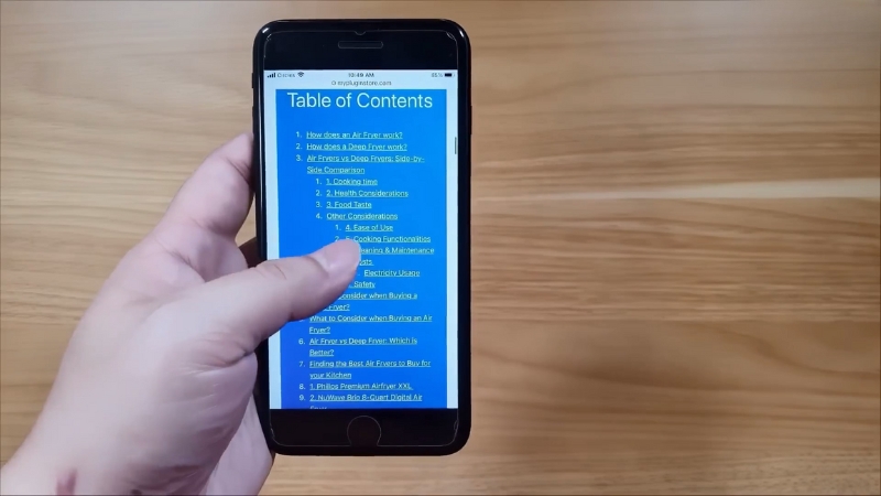
On mobile devices, where screen height is limited and scroll cost is higher, this structural overview becomes even more important. UX studies consistently show that users prefer navigable content over linear scrolling when information density is high.
What an Automatic Table of Contents Actually Does
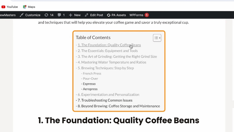
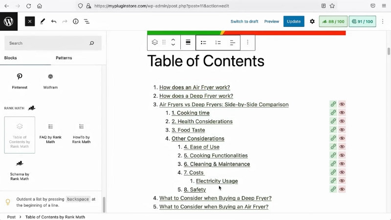
An automatic table of contents is not a static list manually typed into an article. It is a dynamically generated navigation element that detects headings such as H2, H3, and sometimes H4, and converts them into anchor links.
These links allow instant jumps to specific sections without page reloads. In modern implementations, the table of contents also highlights the currently active section as the reader scrolls, reinforcing orientation and reducing cognitive load.
The automation aspect matters because it removes editorial overhead. Writers do not need to maintain links manually, editors do not need to update anchors when headings change, and the table stays accurate even when content is reorganized.
This makes it suitable for large blogs, multi-author sites, and publications that update evergreen content frequently.
Impact on User Behavior and Engagement Metrics
The presence of a table of contents influences measurable user behavior. Heatmap and scroll-tracking studies show that readers are more likely to engage with deeper sections of an article when they can see them listed upfront.
Instead of abandoning a page after scanning the introduction, users often jump directly to sections that match their intent.
From an analytics perspective, this often results in higher average session duration and lower bounce rates for long-form content.
While a table of contents can increase internal jumping and reduce linear scrolling, this does not indicate disengagement. On the contrary, it reflects intentional reading behavior.
Users who click section links are actively interacting with the content rather than passively skimming.
The table below summarizes common behavioral changes observed after implementing an automatic table of contents on long-form blogs.
Metric
Typical Change After TOC Implementation
Reason
Average time on page
Increase of 10–25 percent
Easier access to relevant sections
Scroll depth
More uneven but deeper section engagement
Users jump to specific headings
Bounce rate
Decrease of 5–15 percent
Clear structure reduces early exits
Internal navigation
Increase in anchor link interaction
Readers use the TOC as navigation
Mobile engagement
Noticeable improvement
Reduced scroll fatigue on small screens
Accessibility and Readability Considerations
View this post on Instagram
Beyond engagement metrics, a table of contents plays an important role in accessibility. Screen readers rely heavily on document structure to help visually impaired users navigate content.
When headings are properly marked up and exposed through a table of contents, assistive technologies can offer faster navigation and clearer context. This aligns with Web Content Accessibility Guidelines, which emphasize meaningful structure and navigable content for long documents.
Readability also improves for non-native speakers and readers with lower attention thresholds. A visible outline allows them to mentally map the article before reading, decide which sections are relevant, and skip unnecessary parts without feeling lost.
This is especially important for technical or data-heavy articles where readers may only need specific subsections.
SEO Implications without Overstating Benefits
Search engines do not rank pages higher simply because they have a table of contents. However, indirect SEO effects are well documented. Structured content with clear headings improves crawl efficiency and helps search engines understand topical hierarchy.
In many cases, anchor-linked headings from a table of contents are used to generate sitelinks or jump-to links in search results, especially for how-to guides and informational queries.
These jump-to links can improve click-through rates because users see that the page directly answers multiple sub-questions. This does not replace solid content or proper keyword research, but it complements them by making structure explicit.
Importantly, a table of contents does not dilute keyword relevance when implemented correctly, since it mirrors existing headings rather than introducing redundant text.
Manual versus Automatic Tables of Contents
Some blogs still rely on manually created tables of contents, particularly in static environments. While this approach can work for small sites, it introduces maintenance risks as content grows.
Automatic generation avoids these problems by tying the table directly to heading markup.
The comparison below outlines the practical differences between manual and automatic approaches.
Aspect
Manual Table of Contents
Automatic Table of Contents
Setup time
Low initially
Moderate initial setup
Ongoing maintenance
High
Minimal
Accuracy after edits
Error-prone
Always synchronized
Scalability
Poor for large sites
Suitable for large blogs
Multi-author consistency
Difficult
Consistent by default
Where and How to Display a Table of Contents
Placement affects usability. The most common and effective position is directly after the introduction, before the first major section. This ensures readers encounter the structure immediately after understanding the topic.
For very long articles, some sites also use a sticky sidebar table of contents on desktop screens, while collapsing it into a toggle on mobile devices to preserve screen space.
The design should remain minimal. A table of contents is a navigational aid, not a decorative element. Excessive styling, icons, or animations can distract from its purpose.
Clear text links, proper indentation for heading levels, and sufficient contrast are usually sufficient. The goal is clarity, not emphasis.
Common Implementation Pitfalls
Despite its simplicity, a table of contents can harm UX if implemented poorly. Including too many heading levels can overwhelm readers, especially when every minor subsection appears in the list.
Limiting the table to H2 and H3 headings usually provides the right balance between overview and detail.
Another frequent issue is poor anchor behavior. Abrupt jumps that hide headings behind fixed headers or navigation bars frustrate users.
Proper offset handling ensures that the target heading is fully visible after clicking a link. Performance should also be considered. Lightweight scripts or native platform features are preferable to heavy client-side libraries that slow page load times.
When a Table of Contents Is Not Necessary
@blogaid Is a Table of Contents good for SEO? #wordpress #seo #ranking #rankingfactors #blogger #blogging #blogaid ♬ original sound – BlogAid
Not every blog post needs a table of contents. Short articles under 800 words rarely benefit from one, and opinion pieces or narrative essays often rely on linear reading rather than section-based navigation.
The decision should be driven by content length, structural complexity, and reader intent, not by rigid templates.
For blogs that consistently publish long, instructional, or research-oriented content, however, an automatic table of contents becomes part of baseline usability rather than an optional enhancement.
It respects the reader’s time, supports different reading strategies, and aligns with modern expectations for structured digital content.
Final Perspective
An automatic table of contents improves blog UX by making long-form content easier to understand, navigate, and consume without changing the substance of the writing. Its value lies in structure, not decoration, and in usability, not trend-following.
When implemented thoughtfully, it serves readers, editors, and search engines at the same time, which is why it has become a standard feature on high-quality blog websites that take long-form publishing seriously.